Okay, so, there's this girl named Cheyenne who is just not that great at graphic design, and she attempts to create a film poster for her documentary. Also, she has this super great and fun idea that would look totally great if she could get it going, yet life isn't feeeeling that right now. Let's just say this girl searched tirelessly, for hours, how to use a basic program like Microsoft Word to put text inside of a large letter made from WordArt.
She's got this letter:

And this text:

AND NO WAY TO PUT THEM TOGETHER. This is what the fantastic Microsoft Office gave me instead:

 Finally, by some miracle, I decided to use Pages for my endeavor. To my pleasure, I had the chance to draw my own shape (the beautiful "Z" seen below), and I was able to fill it with a screenshot I had taken of the text. What a great discovery and I didn't even need a tutorial!! #proud Usually Pages isn't helpful when I do these sorts of projects because it has a lot less features than other programs, but Pages is redeemed in my heart. Here is what I was able to create:
Isn't it beautiful :'). Originally, I had screenshotted the "Z" to use an online template for creating the movie poster, but that didn't work out because the background was white for the "Z", and I couldn't remove it without some sort of Photoshop tool. So, I decided to play around with canva because it was easier to use overall, and it gave me more options. I decided to send the "Z" to Kass's laptop so that she could use mine to edit while I designed the poster, and I transferred it directly from Pages (and the background became transparent)!!! It was great because now I know how to do that if I need to. Also, I was able to use backgrounds for the poster.
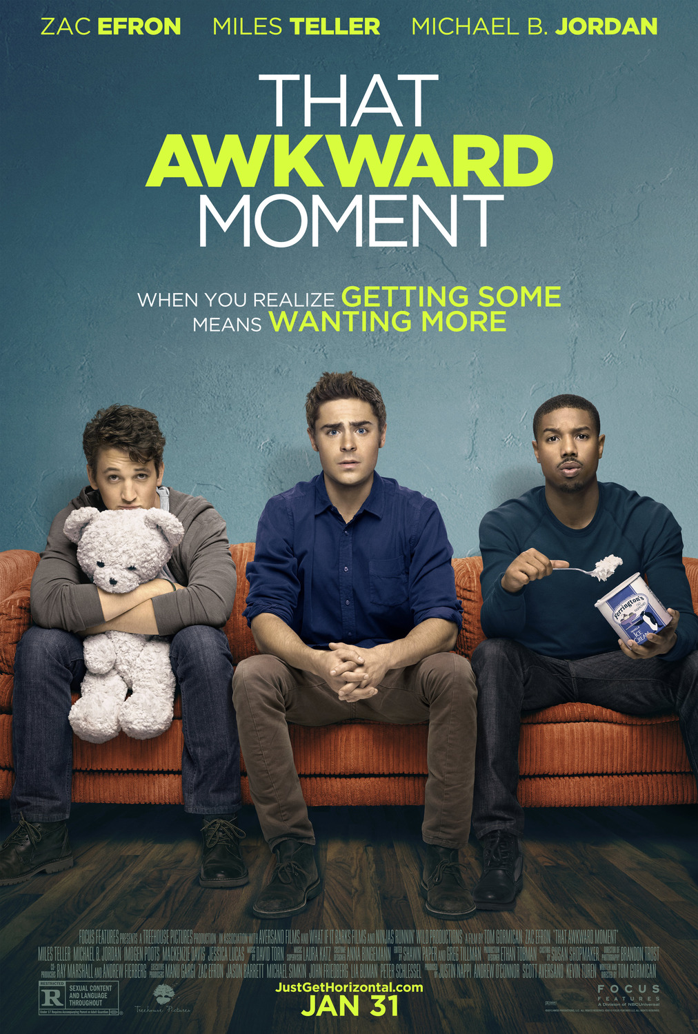
One our inspirations for movie posters was That Awkward Moment because we found it to be fun, colorful, and similar to our idea for our own. Since we changed the title of our film from We Are Not Who You Think We Are to Z, we wanted to use our original idea as a slogan, which That Awkward Moment also has. When I discussed the poster ideas with Kass, we both agreed that we wanted a color in the background that would pop with the white Z, and as a huge fan of the color blue, I immediately went for it. We found kind of a gradient background that darkens as it goes down, and it definitely makes the title stand out.

That's all for now,
Chey :)
No comments:
Post a Comment