Wednesday, April 12, 2017

The Best Day EVER

Mood: Jocular

Editing:
Ha ha.. so guess what happened to me today? As I was editing, iMovie thought it would be the best idea ever to unexpectedly quit and delete all of my media and movies. My entire edited project? *Poof* I immediately googled how to remedy this issue and went digging through the deepest folders of my computer that I didn't know existed to fix it. I found this lifesaving help thread that suggested duplicating the file I had previously (that showed as inactive when I clicked "file info"), and creating a new library on iMovie. The only issue was that my startup disk was out of space, so I couldn't duplicate the enormous file! I spent 2 hours transferring pictures, videos, and documents to Google Photos, Google Drive, and several USBs until I could finally copy the file, and the doc came back! However, none of my other projects did, but oh well. That's a later problem.

Anyhow, after that rough point, I got back to editing. Kass helped add some of the new shots we had taken a few days prior for B-roll, going through to find what was useable. She also found some good music called "North" that fit for the end of the doc, as the new music I found, "Always Hopeful," did not fit well through the entire second segment. Again, we used Youtube's Audio Library (my go-to) for this copyright free music. The music works really well together to switch tones with the narration, and I'm layering the end and beginning of each song on top of each other while fading them in/out, respectively, to allow for a smooth transition. 

Editing has been extremely hard for me with this project because the shots are abstract, and it's hard for me to figure out what matches different parts of the narrative. I have all of the useable shots (every useable piece extracted from larger clips with random shaking/blip trimmed out) in my editing doc, but ordering them to line up with the narration has been messy. I've had to split parts of the narration to link them to different visuals, which I learned the hard way, otherwise the narration would be disjointed and out of order every time I delete or move a shot. Anyhow, I've gotten the hang of it and go through it second by second; I've familiarized myself with all of the shots I have to work with, so now I put a shot or black background where I feel necessary, the background there to hold a space for a possible shot. As of now, the doc is projected to end at around 5 minutes and 4ish seconds.

Website:
As for our progress with the website, Kass has been doing tons of research and writing for it. She told me about this cool thing called the "Street Team" that Fueled By Ramen uses to promote their bands, and she suggested we create our own to promote our doc, as well as encourage Gen Zers to be themselves and get involved in their communities. We took turns editing each other's stuff for the website, but Kass worked more with the site and had a better grasp over how Weebly worked, so she did a lot of formatting for the images and text. By the way, we changed our link to wearegenzproject.weebly.com and changed this on our movie poster as well. We felt that it was better than the previous link because before it sounded like We Are Gen Z was our doc title. This way, it shows that we have a cause and our doc is just one part of it all.

See ya soon with our final products!!
Chey :)

AGHHHHHH

Mood: IRRITATED... ha ha ha

Okay, so, there's this girl named Cheyenne who is just not that great at graphic design, and she attempts to create a film poster for her documentary. Also, she has this super great and fun idea that would look totally great if she could get it going, yet life isn't feeeeling that right now. Let's just say this girl searched tirelessly, for hours, how to use a basic program like Microsoft Word to put text inside of a large letter made from WordArt.

She's got this letter:

And this text:

AND NO WAY TO PUT THEM TOGETHER. This is what the fantastic Microsoft Office gave me instead:

Honestly, not seeing how this would be useful to me in any way, but oh well. It would be problematic because the text would distract and take away from the title and the other information we would add (such as director, release date, etc). I tried this link, and this one, and this one, and oh yeah, this one... plus, I tried to use A TON of word cloud sites, but it wouldn't let me change the shape for a lot of them, so it didn't help.

Finally, by some miracle, I decided to use Pages for my endeavor. To my pleasure, I had the chance to draw my own shape (the beautiful "Z" seen below), and I was able to fill it with a screenshot I had taken of the text. What a great discovery and I didn't even need a tutorial!! #proud Usually Pages isn't helpful when I do these sorts of projects because it has a lot less features than other programs, but Pages is redeemed in my heart. Here is what I was able to create:

Isn't it beautiful :'). Originally, I had screenshotted the "Z" to use an online template for creating the movie poster, but that didn't work out because the background was white for the "Z", and I couldn't remove it without some sort of Photoshop tool. So, I decided to play around with canva because it was easier to use overall, and it gave me more options. I decided to send the "Z" to Kass's laptop so that she could use mine to edit while I designed the poster, and I transferred it directly from Pages (and the background became transparent)!!! It was great because now I know how to do that if I need to. Also, I was able to use backgrounds for the poster.

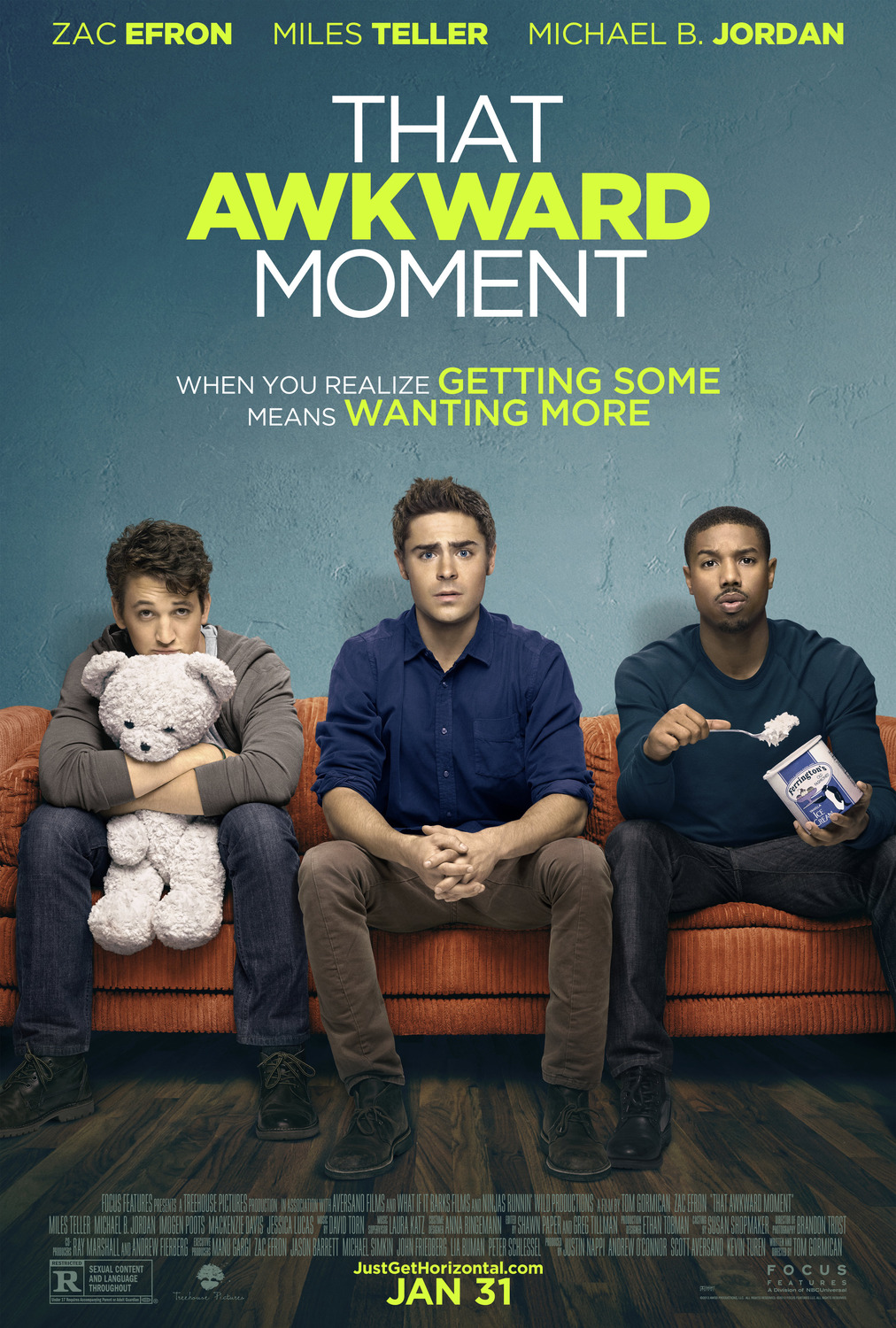
One our inspirations for movie posters was That Awkward Moment because we found it to be fun, colorful, and similar to our idea for our own. Since we changed the title of our film from We Are Not Who You Think We Are to Z, we wanted to use our original idea as a slogan, which That Awkward Moment also has. When I discussed the poster ideas with Kass, we both agreed that we wanted a color in the background that would pop with the white Z, and as a huge fan of the color blue, I immediately went for it. We found kind of a gradient background that darkens as it goes down, and it definitely makes the title stand out. 


That's all for now,
Chey :)

Tuesday, April 11, 2017

Movie Poster Brainstorm!

Mood: Contemplative 
(with a hint of indecisiveness)

Okay, so, Kass and I have gone through SO many ideas for our documentary poster. We thought about using a bajilion people to create a Z -- OH WAIT, UPDATE! After some long, deep reflection, we have decided to change our title to Z. Okay, hear me out: We liked We Are Not Who You Think We Are, but we felt that it was too long of a title and looked off when we added it in our doc as a title slide. Also, it was hard to maintain cohesion with our production and social campaign because it was too long (like I said previously, there's no way our website would be called wearenotwhoyouthinkweare.weebly.com because yikes, what a mouthful). Additionally, we felt that Z was simple, yet it could be extremely powerful if we went about it in the right way. The simplicity of the title will add an element of mystery when people hear it - "What the heck is that new doc Z about? I'd better check it out hmmm." <---- You see! It's great.

Okay, back to the poster ideas, I got a bit sidetracked!! Basically, Kass and I did some heavy brainstorming to try and come up with ideas for it. We thought about using different people's arms to construct a "Z" which we thought would show togetherness, diversity, and the title (whoo). Another idea was to use several people and lie them down to create a "Z". As for backgrounds, we like the sky for the first idea because it represents openness and that's why birds fly in freedom. I love symbolism :'). Another idea was to go the computer-designed way. We would create a "Z" with a bold outline and use the inside to fill it with words that describe Gen Zers. 

We also tried this (see left) with a photo editing app and, honestly, it didn't come out too cute. We had to scrap it so quickly because we were slightly terrified of what we had produced... lol. What a great concept, but we didn't like our version. The idea we did use? Hehe, well that's to be revealed soon. 

Also, some editing issues parte dos:
I loathe the "but they're wrong" audio clips. Yes, I know, I was just praising them a few posts ago because they are great in theory; in practice however, they completely disrupt the flow of the doc and instead of creating a shift in tone, they just make me uncomfortable because they sound SO wrong. Sigh. I'm currently trying to figure out how to remedy this and bridge the two sections of the intro together. They are both complete, and I changed the colors of the first part ("they call us...") to be colder and more blue, while the second set of shots are warmer and more yellow, so this is the only part that needs fixing. 

Stay tuned,
Chey :)


Monday, April 10, 2017

Working Hard or Hardly Working?

Mood: Definitely Working Hard

Hey there! It's been an extremely productive day, and Kass and I met up (finally!) so that we could discuss our website and poster ideas that we had come up with previously. Now we just have to agree on some things and then finish creating the products. 

Like I said a few posts ago, I did begin the website on weebly.com and chose a URL and template. When Kass and I met up, she said she liked the layout, and we went to work. We checked out a few websites for inspiration and found Lana Del Rey, Melanie Martinez, and Miss Representation to have the best sites.

The Miss Representation site was super cool and helpful, especially because it's a documentary that also concerns representation, only with women in the media. Here are some images of the home page on the website:
They include their logo, as well as social media links and various tabs to explain their cause and promote their doc. 
Here, they provide a short explanation of the issue on the home page, which is a great way to promote people to explore it in more depth after being exposed to the information.

These two sections of the home page also encourage people to more deeply explore the website and get involved by viewing the documentary and then participating in the social movement to speak out against negative representations of women in the media.
We decided to have several sections of our website such as (obviously) the home page, as well as a few others:
1) Why Gen Z? - An explanation for how wechose what to explore and portray in our documentary as well as information about the Generation as a whole. We will discuss problems with our representation, as well as what we believe to be accurate.
2) Merch - Money from this store will go to support our future filmmaking costs)
3) #WeAreGenZ - Our social media campaign that will involve and inspire members of Gen Z to be great and interact with our content and productions
4) The Creators - All about Kass and I whoooo
5) See The Film - This tab was on the Miss Representation website, and it's extremely important because we need to offer our audience ways to view the documentary and places it will be shown

For #WeAreGenZ, Kass and I decided that by creating a hashtag to associate with our productions, we would generate more buzz for the documentary, as well as engage and build a foundation for potential viewers, both currently and in the future. Members of Generation Z are digital natives, so it's best to gain their attention with this hashtag through social networking platforms such as Instagram and Twitter. To further engage with them, part of our social campaign will include targeting them on Snapchat. According to one Forbes article, members of Gen Z enjoy posting for their friends rather than publicly, which is why Snapchat is a great platform; they can share information with their friends by holding down the screen for a few seconds and pressing send, a quick and easy process that will make info about our doc spread more easily. 

As for our Merch tab, Kass had some fun designing shirts, hats, and tanks to preview in our store. The items are available to males and females in varying sizes and colors, and word-of-mouth is another great way to publicize our documentary. There are arrows on the side to switch between products, as well as a button to easily access the store for purchase. Here is an image of our cool store:


Alright, I'm going to get back to work and will update soon about the poster and editing, too!
Chey :)


Can't Stop, Won't Stop (Editing)

Mood: Persevering

Hey! Just a little update on my editing last night, which went on for quite a while. I used Quicktime to make a screen recording of my editing process (a cool feature I discovered doing my project last year, but I recently started using it). Here's a little video (thanks to a 15000% speed increase) of my editing:


Again, I worked on cropping shots, fixing headroom, matching the background color of various shots, organizing the order of shots for maximum flow, etc. I also delved into the sound portion of editing, which I also used iMovie for. Basically, for the sound, Kass recorded each of our subjects saying the following 3 things:

#1: They call us lazy. They call us ignorant. They call us dependent. They call us superficial. They call us irresponsible. They call us spoiled. They call us self-absorbed. They call us apathetic.
#2: But they're wrong.
#3: We are innovators. We are caring. We are special. We are valuable. We are respectable. We are intelligent. We are involved. We are the future. We are Generation Z, and we are not who you think we are.

For ease, each number is its own recording so that in editing, they are easy to separate and use. The plan was to use all of our subjects voices throughout the intro, and to use the best recorded words/phrases for each person. For #2, we decided that the best voice would be used because the line is extremely important in shifting the tone of our piece. The talented winner is -- drumroll please -- Pedro! I felt that his recording was the strongest and he said it at a nice speed, one that can be easily worked with. Here it is:


Glorious, isn't is? :D Anyhow, I will be back in no time to give some further updates on my individual progress and how the doc overall is coming together. It's an exciting time, so I'll keep ya posted!

Chey :)

Sunday, April 9, 2017

Fix It, Change It, Rearrange It

Mood: Nitpicky

Hey there! I've been editing up a storm for the past few days, as well as finalizing the script and working on the website. It's been SUPER busy for me, as I know there's a lot to get done. Kass and I will go over everything we have when she gets back from her trip, and all we'll need to do is finish up some last-minute scenes (which won't be bad - we know what we want now). 

So, editing. Here are a few things I've noticed:
1. The projector decided to be funny and change the color of our slide throughout our filming day, so I've been editing each video on iMovie to fix this problem. I'm very proud to say that I learned how to match the color of the videos to one another all by myself, no tutorial needed! I've come a long way :')
DO YOU SEE THIS MAGIC!!!!

2. The head room for each subject is a little different each time, as we filmed our subjects at different times and moved the camera around for different angles. Therefore, the compositions are not the same for them all, and the head room is a little much for some of the shorter subjects. I realized this problem during filming, as the words were projected differently on each subject due to height differences, and I tried to remedy that by adjusting the projector's height (stacking yearbook on top of yearbook, I knew they were good for something)! Alas, the differences prevail, so I'm just cropping the videos to lessen the visual disconnect between shots and amount of head room.

Now, about the website:
I have no idea what to make the URL because, and I don't know if it's just me, but wearenotwhoyouthinkweare.weebly.com seems like a bit much... plus, I don't think anyone would remember the URL WANWYTWA.weebly.com either, so I think the winner is WeAreGenZ.weebly.com. Short and sweet.

Anyhow, I'll update you soon on how the design/layout is going, but I'm definitely putting the most important content on the home page for easy access!

And by the way, I'm totally loving the music with all of our shots!! That's a great sign because music is such an integral part of creating a tone for our piece, so I'm happy. :)