Alright, alright, this is OFFICIALLY my last post. Here is my CCR for Z:
Thank you for everything!
Chey :)


 Editing has been extremely hard for me with this project because the shots are abstract, and it's hard for me to figure out what matches different parts of the narrative. I have all of the useable shots (every useable piece extracted from larger clips with random shaking/blip trimmed out) in my editing doc, but ordering them to line up with the narration has been messy. I've had to split parts of the narration to link them to different visuals, which I learned the hard way, otherwise the narration would be disjointed and out of order every time I delete or move a shot. Anyhow, I've gotten the hang of it and go through it second by second; I've familiarized myself with all of the shots I have to work with, so now I put a shot or black background where I feel necessary, the background there to hold a space for a possible shot. As of now, the doc is projected to end at around 5 minutes and 4ish seconds.


 Finally, by some miracle, I decided to use Pages for my endeavor. To my pleasure, I had the chance to draw my own shape (the beautiful "Z" seen below), and I was able to fill it with a screenshot I had taken of the text. What a great discovery and I didn't even need a tutorial!! #proud Usually Pages isn't helpful when I do these sorts of projects because it has a lot less features than other programs, but Pages is redeemed in my heart. Here is what I was able to create:

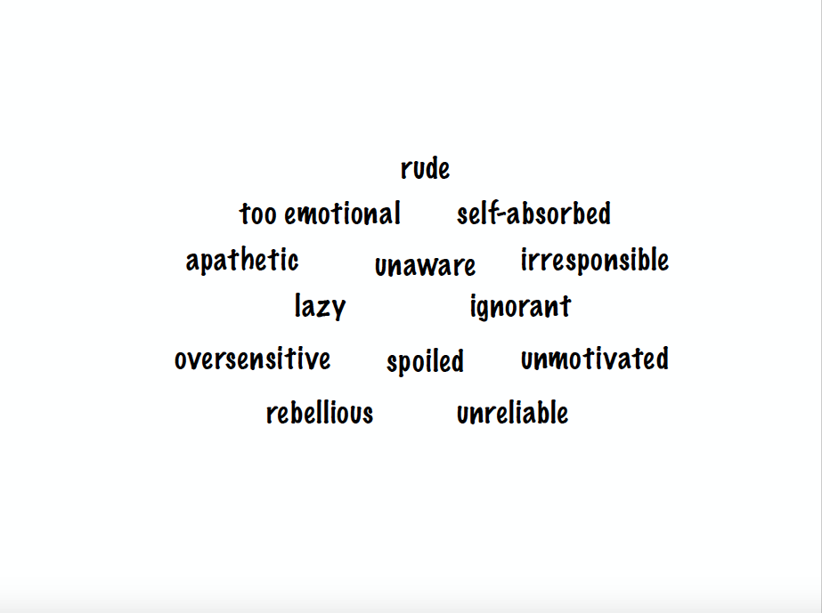
 Okay, back to the poster ideas, I got a bit sidetracked!! Basically, Kass and I did some heavy brainstorming to try and come up with ideas for it. We thought about using different people's arms to construct a "Z" which we thought would show togetherness, diversity, and the title (whoo). Another idea was to use several people and lie them down to create a "Z". As for backgrounds, we like the sky for the first idea because it represents openness and that's why birds fly in freedom. I love symbolism :'). Another idea was to go the computer-designed way. We would create a "Z" with a bold outline and use the inside to fill it with words that describe Gen Zers.
  We also tried this (see left) with a photo editing app and, honestly, it didn't come out too cute. We had to scrap it so quickly because we were slightly terrified of what we had produced... lol. What a great concept, but we didn't like our version. The idea we did use? Hehe, well that's to be revealed soon.
  |
| They include their logo, as well as social media links and various tabs to explain their cause and promote their doc. |
 |
Here, they provide a short explanation of the issue on the home page, which is a great way to promote people to explore it in more depth after being exposed to the information.
|
 |
| These two sections of the home page also encourage people to more deeply explore the website and get involved by viewing the documentary and then participating in the social movement to speak out against negative representations of women in the media. |


 |
| The beautiful and innovative lighting set up. |